
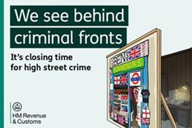


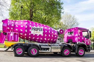
Propercorn has undergone a brand refresh to increase shelf standout and add personality to its seven flavours.
The new packaging features hand-drawn illustrations created by seven artists from around the world.
As well as moving away from black and white illustrations, Propercorn has revealed a refreshed logo and clearer typeface for the flavour names. The popcorn pattern and colour palette have been retained as brand signifiers, with kernel size increased and pantones brightened.
The new packs are being rolled out this Spring, with the refreshed creative reflected across Propercorn’s point of sale.


No comments yet