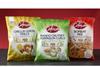
Cofresh, the UK’s No 1 Indian snack brand, has relaunched its entire range with fresh new packaging to maximise shelf impact and brand integration.

The new packaging for more than 200 products now incorporates a contemporary design which combines consumer-friendly features such as a clear front window on the popular Asian mixes, and modern typography with colour-coordinated graphic elements to reflect the company’s Indian heritage. New features include greater emphasis on Cofresh’s instantly recognisable logo which echoes the traditional Hindu ‘Bindi’ red dot, vivid pack colours to replicate the brilliant colours of Indian saris and a bright sunburst for greater on-shelf impact and recognition.

Cofresh has also relaunched the shelf-ready packaging (SRP) for its Indian snacks. The new black format incorporating its ‘with love & spice’ strapline delivers high shelf visibility while the familiar Cofresh logo ensures brand continuity and recognition.

“Cofresh is a long established beacon brand which has always delivered high impact at the fixture, but over the years some products tended to develop their own individual identities,” explains Debbie King, director of commercial sales & marketing.

“Through the packaging re-design each product retains its own identity but we’ve harmonised the range so that it will remain recognisable to loyal customers while appealing to new consumers. It’s a case of evolution not revolution!”

The successful combination of Cofresh’s authentic Indian heritage and its recent investment in new pack design, advertising, PR and social media has seen a growth of over 40% in its core range of Asian mixes in 2017. Best-selling lines amongst the 200-strong product portfolio include the Bombay, Balti and Gujarati Mixes in 325g sharing bags, ‘Chakri’ Rice Sticks, the potato-based ‘Mix-Ups’ inspired by some of the UK’s best-loved curry flavours, and ‘Ruff Nuts’ crunchy coated peanuts.