


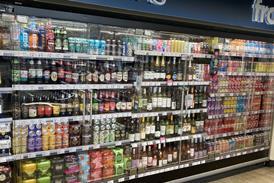


Vimto has unveiled a new visual identity across its entire portfolio.
According to the brand, the new design hopes to deliver a cleaner, bolder and more modern look that represents Vimto’s unique and refreshingly different brand personality.
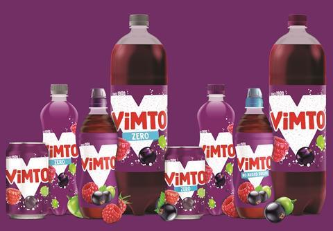
Designed to represent Vimto’s personality whilst championing the brand’s unique and refreshingly different taste, the new look also aims to inject some playfulness into the soft drink category. Centred around a striking ‘V’, which also provides strong on-shelf standout, the new design pays homage to the brand’s 113-year heritage with the inclusion of ‘since1908’ as well as the brand’s red, white and purple colour palette.
Senior brand manager at Vimto Becky Unwin said: “We have worked hard to create a new visual identity for such an iconic and well-loved brand. We are confident that we’ve created something that no only speaks to our target market but also celebrates and communicates Vimto’s personality.
“As one of the leaders in healthy hydration, the new modern design stands out on shelf and enables us to highlight more of our product benefits, such as real fruit ingredients and added vitamins – all helping consumers to navigate the options available and make Vimto the obvious choice. The redesign for Vimto marks the start of what will be an exciting year and we can’t wait to reveal what we have in store.”


No comments yet