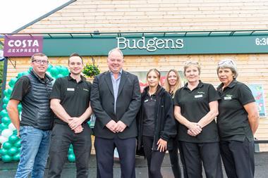
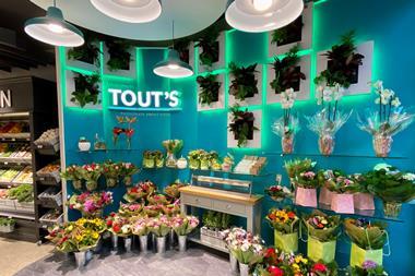
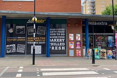
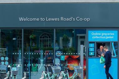
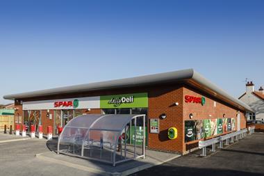
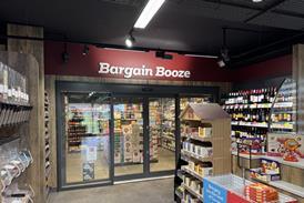
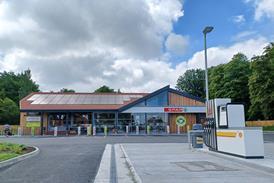
The huge sea change which the convenience channel has undergone in the last decade is due, in no small part, to the strong design and visual imagery which is increasingly being adopted across the sector. From symbol groups to small independents, successful retailers have come to realise that a strong look and good signage is about more than just showing the way to a particular product or section. The right signage speaks as much about a store’s own brand as the products within. With research showing that it takes less than a second for marketers to convince shoppers to see their display, the right signage can engender trust and highlight your history and professionalism in the blink of an eye, taking your customers on a spending journey leading right into the retailer’s till. Convenience Store speaks to some of the retailers who have got it right and are now reaping the benefits.

Simply Fresh

Package your store

Kash Khera

When Simply Fresh director Kash Khera first came up with the concept of Simply Fresh, visual imagery was at the heart of it. “If a product is nicely packaged your mind believes it tastes nice before you’ve even tried it. You’ve got to think of your shop as your product and signage and imagery is what makes the customer want to try it. It’s about the upsell, getting that little bit more for that tin of beans.”

Simply Fresh

He says that good visual imagery makes customers keen to stay and browse: “I think it’s important for the same reason that people want to choose wallpaper at home - it evokes something. If you put the emphasis on price and you have no strong professional imagery from, say, a symbol group, you end up with your products and your shop looking cheap.” He says that even the big discounters like Aldi are getting the message. “Aldi used to be pretty barren in-store but you go in one now and you see a move toward wooden imagery.”

Simply Fresh

He says touches like his 3D lettering, simple polystyrene painted to look like stone, help the overall feel of difference which came about by thinking outside the usual c-store design concept. Instead of employing a retail design agency, Kash employed restaurant designers to give him what he wanted: “I looked around and realised food to go was the future and that the hospitality look was what we needed.” He recommends retailers who are not part of symbol groups to look online at sites like iStock, or Google Images, or contact design agencies to get ideas.

Scotmid

Exploring history

Scotmid

A store has been located on the site of Scotmid Warrender Park, Edinburgh, since the turn of the century, something which the store celebrates in the form of signage outlining its history. Manager Michael Shiels says the signage was put up as part of a refurbishment last year. “The picture of how we look now and how we used to look in 1890 is something I hear customers talking about all the time. It’s an interesting talking point.”

Warrenders history

The store also uses signage such as ‘Here to help’ instead of the usual ‘Pay here’, and even manages to make its security measures look nice. Says Michael: “The big map of Scotland in store is great for showing that we sell local food. All the signs add a bit of theatre and highlight that we use Scottish suppliers which appeals to customers.”

Biddles

Benefits at the till

frozen food

Another shop that has used its own history in its signage is Biddles Convenience Store, Redditch, Worcestershire, which took the visual stroll through its past as part of a Simply Fresh makeover 18 months ago. Owner Simon Biddle says the idea was partly his and partly down to Simply Fresh.

Biddles story

“I gave the team pointers about how I started and they took it and wrote it out,” he says.

“We’ve had such positive feedback since the change and over doubled our turnover and I think the look plays a strong part in that.” Simon says he has a lot of flexibility with his signs and can contact Simply Fresh directly if he wants anything done. “This helps me be part of something but helps the shop with its own individuality.”

Malcolm’s

Taking the journey

Big night in

According to Pinda Cheema, co-owner of Malcolm’s Store, Coventry, the right visual imagery is all about leading the customer on a journey. “We want them to come in for what they need and leave with what they want, and good visuals is a good way of putting that in their mind.” When the store was refitted three years ago Pinda and brother Paul decided to take a look at signage and came up with several concepts based on current trends. “We wanted to do something different. For instance the Big Night In section is like a store within a store. We realised that the Big Night In phenomenon was going to be huge and we needed to push it. We came up with the idea and Costcutter did the sign - it’s giving the customer buying ideas without them really knowing it.”

Kwiksave

Going digital

kwiksave

Atul Amin of Kwiksave, West Bromwich, decided to take his signage a step further a year ago when he joined Kwiksave. As part of a visual redesign package, digital screens now stand in the window and Atul is delighted with the effect it has had on the rest of the store.

“Before we had posters up and they blocked off the window but now the windows are clear and you can see right through to the shop from the road. Customers really seem to like it,” he says.

The visuals for the screens are downloaded from Kwiksave and display the current promotions. “With the posters, by the end of the promotion they were torn and tatty, but this is so clean and looks so fresh,” Atul adds.

Moortown

Taking risks

visuals

When it comes to signage, going off-palette can be a gamble, but one that’s worth taking, according to Praff Patel of Costcutter, Moortown, Leeds. Instead of going for the usual black on white, or primary colours often favoured by retail, Praff decided he wanted something a bit different. His store signage is silver on black. “We knew we wanted black but we didn’t want what everyone else had so we eventually decided on silver.” He says the signs are striking and standout in store: “The customers love it, they really map out the store and give something above head height to look at.” He says retailers need to consider their signage as an investment. “You have to spend money to get money and the look of your store is part of that,” he says.

Message is key

According to Tim Ellis, business development manager at design agency Momentum Instore, the right signage is crucial to meeting the needs of your consumer on their journey into and around your store: “Signage helps to entice people into store, with engaging window and exterior signage effectively conveying your brand image and also giving shoppers a hint of what they will find inside.” Once inside he says it’s all about finding the right level of signage and not bombarding the customer with too much information: “Research shows that marketers have just 0.9 seconds to convince shoppers to see their display, so if it doesn’t get the message across clearly and in an engaging manner it won’t work.”

Ellis says that c-stores, whether part of a chain or not, need to get their overall branding right and carry it through to their signs, to give customers a sense of security and loyalty. “If signage has a clear association with a brand they trust and are loyal to, it is likely to have a more positive impact. This does not just boil down to branding on the signage, but also clever use of colour and wording,” he says.

Of course retailers can’t be expected to be design experts, but he says that when planning signage, there are some elements everyone should be thinking about: “The content is crucial and retailers need to be confident that whatever wording they choose gets the required message across to the target audience effectively.” Ellis says signage needs to be consistent with all other key messages used by the retailer, so it supports the existing, established brand identity.

Retailers planning signage need to be aware of their demographic and location as both have an impact on what will be well received and what will work: “In a residential area bright signage can be imposing and look out of place, which can put potential shoppers off,” says Ellis. And he has words of caution for retailers looking at digital signage: “All signage needs to fit seamlessly with the store design and layout whilst attracting the right amount of attention, so digital screens should only be used if they are sympathetic to the brand positioning.”

Finally, he says retailers should consider getting in outside help such as agencies who specialise in retail signage.