


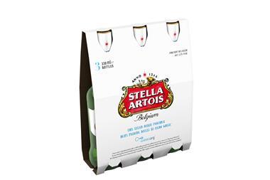
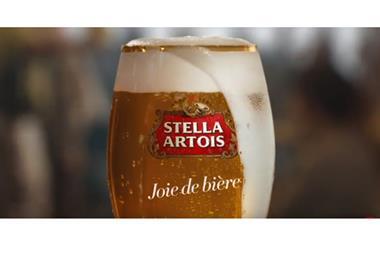
AB InBev has announced the launch of a new packaging design for its Stella Artois brand, launching in stores over the coming weeks.
The new look is designed to showcase the traditional and modern representation of the Stella Artois brand, while championing the products’ heritage and future.
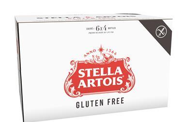
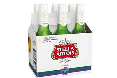
The new labelling includes a redesigned logo and additional imagery that adds texture to the brand’s cans, bottles and packs, while drawing attention to the Stella Artois logo and star.
The refreshed design will be rolled out across all formats in the coming weeks and will be introduced to the Stella Artois 4% range later in the year.
In addition to the new design, changes have also been made to the structure of the Stella Artois packaging. To enhance the bottled beer experience, Stella Artois has added a second perforation to the neck label of its bottles and the Stella Artois canned range will also receive a matte finish from early next year, giving the range a premium look and feel.
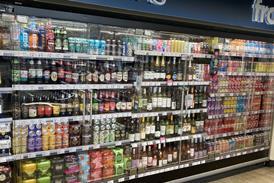
Commenting on the changes, Alexis Berger, marketing director for Stella Artois Europe, said: “Design is absolutely integral for any brand and as a brewer with 600 years’ heritage we do not take redesigns lightly. We are incredibly proud of the new direction the brand aesthetic is taking, highlighting our Belgian heritage but also modernising Stella Artois to lead consumers’ expectations of premium. We’re confident this refreshed design will stand out on shelves and highlight the qualities of Stella Artois which make us the UK’s favourite alcohol brand.”


No comments yet