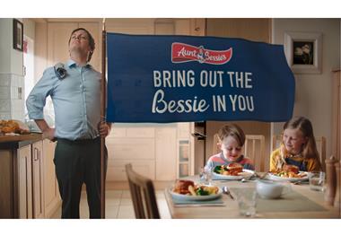
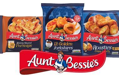
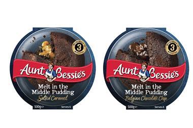
Aunt Bessie’s is redesigning its entire portfolio with a new look to better appeal to the modern-day shopper.

Aunt Bessie's 12 Original Golden Yorkshires

The updated packaging features the return of the brand’s blue on pack colouration, alongside more appealing product shots and a new logo that supports the brand’s ethos of providing ‘food as it should be’.

Aunt Bessie’s head of marketing Sam Dolan said: “Our research told us that the roast is all about the family coming together and enjoying good quality food with no compromises. The reality is that the average family spends around just 30 minutes together each day and consumers don’t want to be stuck in the kitchen.

“Consumers want products that are not only easy to prepare, but also deliver the quality the family deserves, every time. Aunt Bessie’s products have always provided high-quality solutions for roast dinners and midweek meals, which is reinforced by our returning ‘Bring Out the Bessie in You’ campaign.”

“The campaign works perfectly alongside the new-look brand, allowing us to modernise with the consumer while reminding them about the convenience of the range,” Dolan added.

On the back of the refreshed packaging, recipe ideas are included for the first time to increase usage and encourage consumers to share their mealtime creations.

Products featuring the updated look and new logo will be rolled out to retailers in the convenience channel from October. Pack sizes, pricing and skus are unaffected by the updates.