










Frozen fruit snacking brand Froot Pops has unveiled a new visual identity, as it looks to cement its position as one of the UK’s most exciting emerging food brands.
Launched to market in 2024, the brand is already celebrated for bringing “bold flavour, colour and a fresh perspective to the freezer aisle,” through its range of British made whole fruits dipped in chocolate.
The new look, which rolls out this August across its four-strong portfolio, follows a strong and sustained period of growth for the brand which has seen 400 % year-on-year growth, it said.
The brand is also now available in more than 300 independent stores across the UK sold through wholesale distributors including OnTheRocks and CLF. This August will see the brand launch in Ireland for the very first time in Dunnes and Tesco.
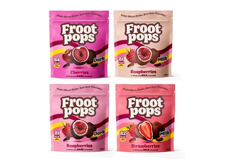
To bring the brand’s personality to life and give greater stand out on shelf, a rich and vibrant colour palette has been used, giving energy whilst maintaining the original essence of playfulness. Taking inspiration from the bold optimism and graphic style of the 1960s, the packs boast a fun retro feel.
Alongside the packaging update, the Froot Pops logo has also been refreshed and refined, whilst keeping the familiar cream and brown colours that reflect the chocolate layers. A nod to the brand’s heritage, it’s been designed to create a more confident, contemporary feel.
Founder Ana Martins said: “I’m so proud of what we’ve achieved at Froot Pops, turning what started out as a homemade treat into one of the UK’s fastest-growing frozen snack brands. This refresh is about much more than the look, it’s about stepping confidently into the next chapter.
”As the brand continues to grow, we wanted our visual identity to better reflect the energy, personality and quality of the product inside the pack.”




No comments yet